Posted by Phil Sharp, Product Manager
(Cross-posted on the Gmail Blog.)
We're always trying to make Gmail faster and easier to use, so today we're introducing a completely redesigned compose and reply experience that does just that.
Faster
How many times have you been writing an email and had to reference something in another message? Saving a draft, opening the old email, and then reopening your draft wastes valuable minutes. The new compose pops up in a window, just like chats (only larger).
This makes it easy to reference any other emails without ever having to close your draft. You can even do a search or keep an eye on new mail as it comes in. And because the compose window works the same way as chats, you can write multiple messages at once and minimize a message to finish it later.
Easier to use
The new compose is designed to let you focus on what's important: your message. The controls are still there when you need them but get out of the way when you don’t. We’ve even added some new features like the ability to easily insert inline images and have more to come.
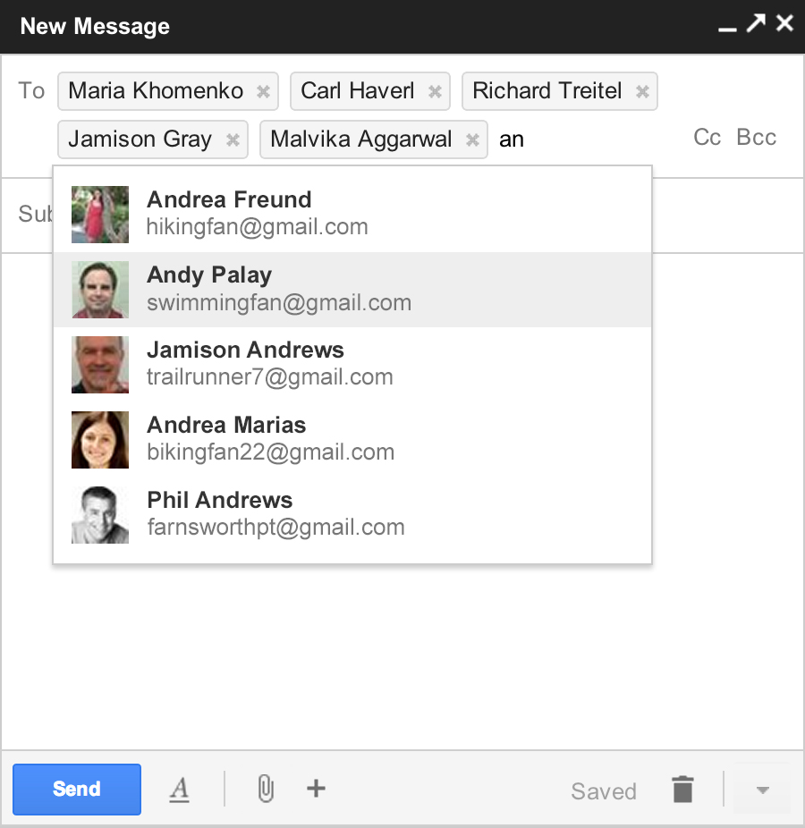
And, when you add recipients to your message, you'll see profile pictures of your contacts in autocomplete helping you find the right person faster. You can also drag and drop the new address chips between to:, cc: and bcc:. When you’re done adding recipients, the address area collapses automatically to get out of your way.

You’ll also see these same changes when you respond to a message. The reply experience has been designed to fit better inline as part of your conversation -- replies take up much less vertical height, intelligently expand to fit your content, and always keep the recipients and other controls in view no matter how long your message gets.
We're rolling out a preview of the new compose and reply today. After we've added some finishing touches over the coming months, we’ll enable it for everyone.


No comments:
Post a Comment